This week I got feedback from my tutor about my website, which I think is very necessary and very useful for me. First of all, the overall impression of the instructor on my website is moderate, which means that my website is not too bad but it is not too good.
I will explain in detail from the following aspects. First of all, in terms of navigation, my navigation system as a whole is not so advantageous, and the operation is still too much dependent on the original theme configuration. Did not really consider the problem when the user clicked. The specific performance is in the navigation system of the title bar. I don’t have a more convenient classification that users can click directly. The second point, in terms of content, my content is quite impressive, but it is still not well reflected in the details. The third point is that in terms of searchability, it can be easily searched but not refined enough. Some useless sections are placed in the upper position, while useful sections are far behind. Finally, the user experience feels average, because the details may make users feel that they are following the rules, and there is room for improvement.

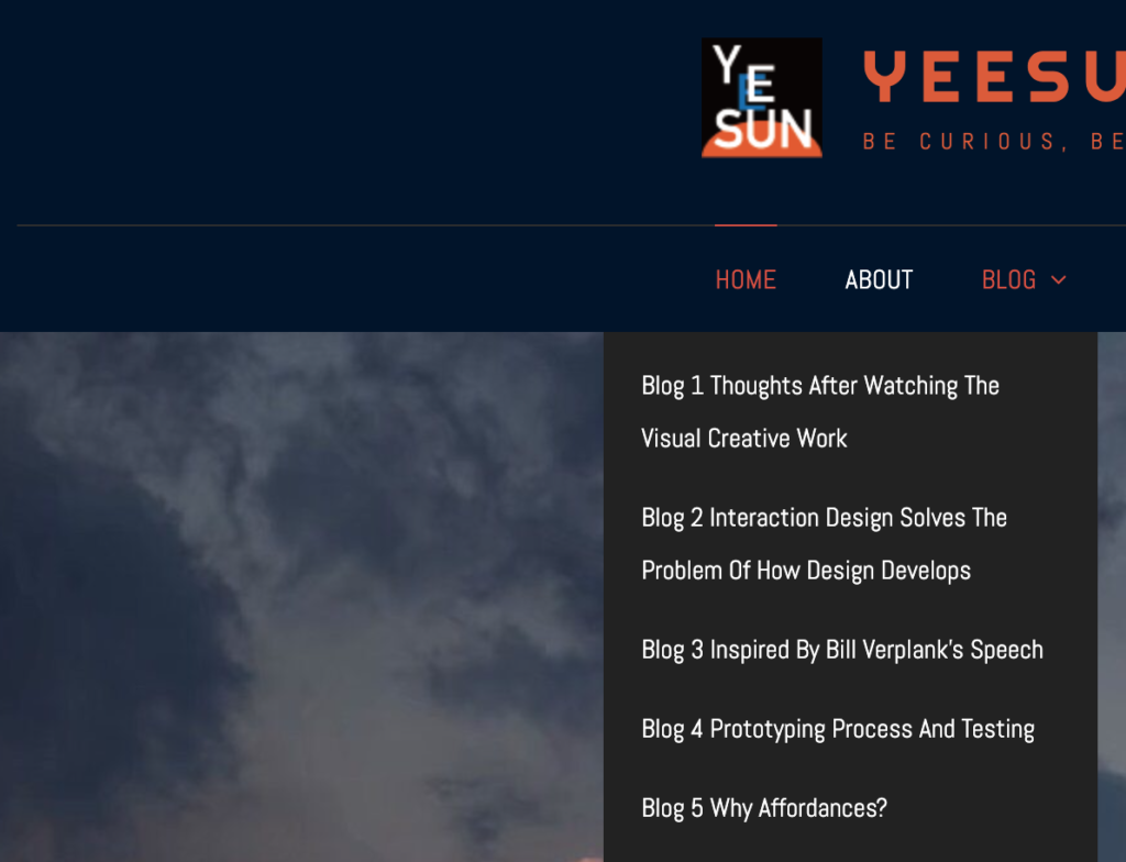
The modification I will make is: first change the navigation pattern in the homepage menu bar, I have made adjustments, see Figure 1. Secondly, I tried changing fonts and colors, adjusted the overall layout of the homepage, and placed the directory section in a more conspicuous place. Several details have been improved and adjusted.

This website is so cool. Goodjob!