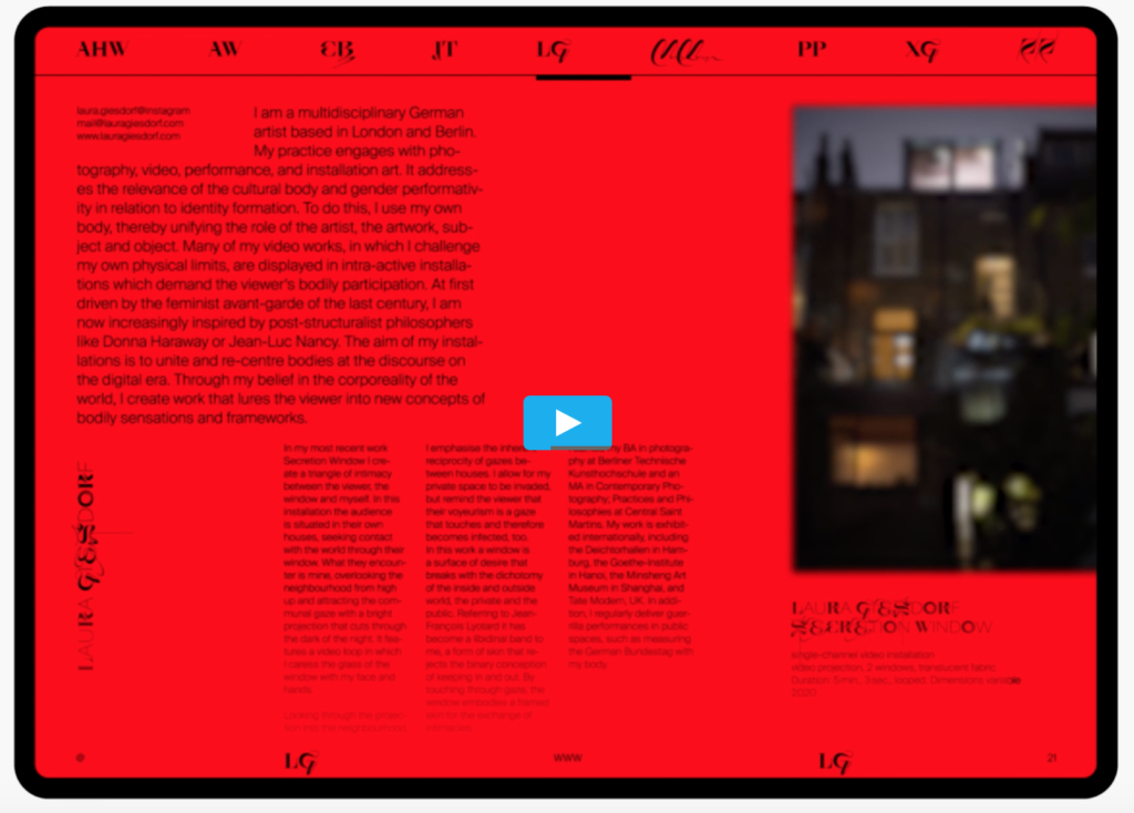
The work I want to show is an e-book project published on Behance, written by Morphoria and published in November 2020. As shown in Figure 1, this book is an electronic publicity book based on the development of art in the epidemic situation in 2020. It shows people the global public health, environmental and economic crisis, social and political problems and racial inequality by introducing the art works in 2020. In terms of form, I think this book is more like an electronic magazine. There are a lot of art pictures displayed and summarized in the book. In typesetting, the designer makes people feel comfortable visually in the arrangement of pictures and words, but the fly in the ointment is that the color saturation is too high, and the red part is too bright for people to read. Imagine that if users can’t see the screen clearly when reading books in the sun, I think the connection between the screen and the picture should be considered when designing e-books.

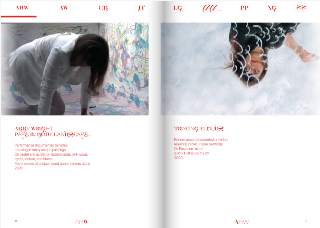
It is worth mentioning that the font design in this book is very novel (see Figure 2). In the title part, page number and footer of the book, the application of font design is very fine, and the linear design makes the whole book look smoother. Different from the physical book, I think its interaction design is very good. As can be seen from Figure 2, users can click in the first column and jump to the book interface they want to browse at any time, and the layout of the e-book is like a classic physical book, so I think it combines the advantages of physical books and e-books to make a clever design.

